7 Quick Tips for Designing Banner Ads
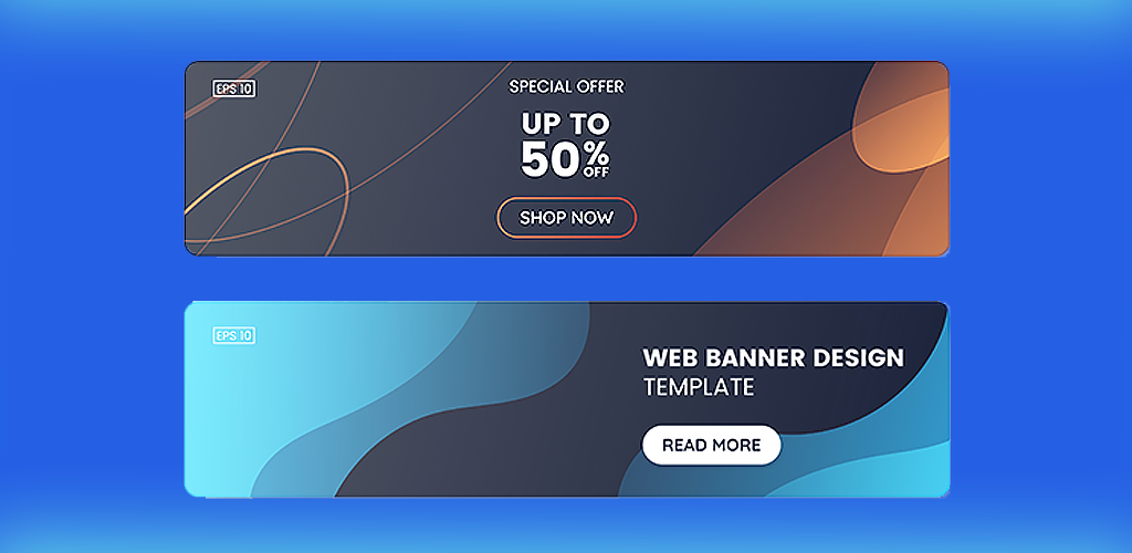
The most effective method for driving traffic to your ecommerce store is through digital advertising. The best digital ads grab the attention of your audience and entice them to act on it. The term “digital advertising” is incredibly broad, however. It can encompass everything from social media posts to blog content. In addition, some forms of advertising are more effective than others. One of the most successful forms is banner ads. This form of graphic advertisement is posted in prominent locations on websites all across the web (typically at the top of a web page, or down the sides). In general, their main purpose is to generate traffic for your website. But they can have secondary purposes as well, including raising brand awareness, increasing sign ups for your newsletter, and encouraging purchases. Part of their success comes from the fact that banner ads can be specifically targeted at audiences who will be most interested in them, thanks to web algorithms. The other part of their success, however, is based on how good you are at designing banner ads. They have to grab the attention of your targeted audience and encourage action. You can increase their success by following these design tips:
- Choose a static or dynamic design
- Pick the right size
- Use high quality visuals
- Don’t overwrite
- Make fonts simple
- Space elements appropriately
- Follow your brand’s standards
Choose a Static or Dynamic Design

There are a few steps you have to take before working on the actual design of your ad. The first step is deciding whether or not you want to create a static or dynamic banner. Static banners are image based and don’t have any moving elements. They’re quite a bit easier to create. Dynamic banners, on the other hand, incorporate movement to draw the eye. The included graphic may be a video or GIF, and the text or buttons included may be animated. These banners are harder to create (and might be more expensive) but may be more effective. You’ll want to make this decision before you start designing banner ads because changing your mind and design after the fact is no easy feat.
Pick the Right Size

Another thing to consider before creating your banner is which size you’d like it to be. The size you choose depends on factors like the position on the website you want it to be featured in (top of the page versus side of the page), and even which websites you plan to advertise on. Not all sites use the same sizes for digital advertisements. That being said, there are some generally accepted standards you can choose from when designing banner ads. They include:
- Rectangle: The most versatile banner ads are rectangular. They can be placed just about anywhere on a website. Commonly accepted rectangle sizes include 300 x 250 pixels, 336 x 280 pixels, and 180 x 150 pixels.
- Square: Square ads are the next most versatile type. They’re great at the sides of a website, or placed throughout site content. The most common sizes are 250 x 250 pixels, or 200 x 200 pixels.
- Leaderboard: Leaderboard ads are featured at the top of a website. The most standard size is 728 x 90 pixels. However, some sites accept the larger size of 970 x 90 pixels.
- Billboard and Poster: Billboard and poster advertisements are also featured at the top of a website, but they’re significantly bigger than leaderboard advertisements. Standard billboard size is 970 x 250 pixels, while posters are usually 1920 x 600 pixels.
- Skyscraper: If you’re designing banner ads to go down the side of a website, you’ll most likely want to choose the skyscraper size, which is 300 x 600 pixels. Alternately, many sites accept 160 x 600 pixels.
- Mobile: Although many websites automatically scale down ads to make them mobile-friendly, you can create your advertisements specifically with mobile sites in mind. Standard sizes include 300 x 50, 300 x 100, 300 x 200, and 250 x 250 pixels.
Before you start designing banner ads, figure out which sites they’ll be featured on so you can make them the right size. You can also make different variations of your ad to fit all common sizes, so you can post them anywhere online.
Use High Quality Visuals

Banner advertisements are so successful because they use visuals to draw the eye. As such, always choose high quality graphics to include in your design. They should be crystal clear (not blurry), identifiable and easily understandable (if you sell umbrellas, don’t use an abstract umbrella and expect your audience to sit there and figure it out), sized correctly (not stretched or shrunken), and immediately tell your audience something about your brand (such as what you sell, what you stand for, etc.).
Don’t Overwrite

When creating your digital advertisement, keep text to a minimum. Banners are successful because they rely highly on graphics. If you inundate audiences with text they have to read, they’re more likely to skip over your ad altogether. Because of this, write your text ahead of time and include only the most important details. These details include a call-to-action and a keyword or two. Calls-to-action take the form of a button that asks your audience to take an action by clicking the button. For example, if you’re running a sale and you want audiences to buy something, your call-to-action button may say something like “Shop Now!” The keywords you include should also help contextualize your ad. For example, you may write “Summer Sale, Everything 50% Off!” This tells your audience the point of your ad, and explains why they should act now.
In addition, always spellcheck your text; a misspelled word reduces the trustworthiness of an ad.
Make Fonts Simple When Designing Banner Ads
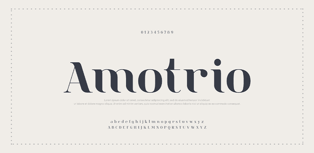
When you finally start designing your ad, choose simple, easy-to-read fonts. The simpler they are, the more effective they’ll be at communicating the information you need to share without scaring audiences away. In addition, if your ad has text in a few different places, limit yourself to only one or two fonts (even if you want to use more). The more different fonts you include, the messier your ad becomes and the more likely people are to skip right over it.
Space Elements Appropriately
Another important aspect of the actual design is spacing. If you don’t space elements (like buttons, text, and graphics) appropriately, your ad may become cluttered and difficult to read. This is another thing that will lead audiences to skip over it entirely, completely negating your hard work and time spent. In addition, don’t leave so much space that audiences can’t take everything in at a glance; if they have to scroll down a page to see your full ad, it’s ineffective.
Follow Your Brand’s Standards
Part of the reason companies advertise is to keep their brand top of mind for audiences. Because of this, the most effective advertisements immediately tell the audience that it belongs to your brand. You can accomplish this by incorporating your brand’s standards into your design. Use fonts or colours that correspond with your brand’s previous designs, add your logo to the ad, include your slogan if you have one (and have space for it), etc. The quicker customers recognize your ad as belonging to your company, the better.
Banner ads can be an incredibly effective advertising tool for any business, but a poor design can stop their success in its tracks. These tips will help you design a banner ad guaranteed to succeed on any website.
Visit Shopivo and stay tuned for exciting news and updates! Sign up for our emails and stay up-to-date on new developments and features.
