7 Ways to Improve eCommerce Site Navigation to Increase Your Sales
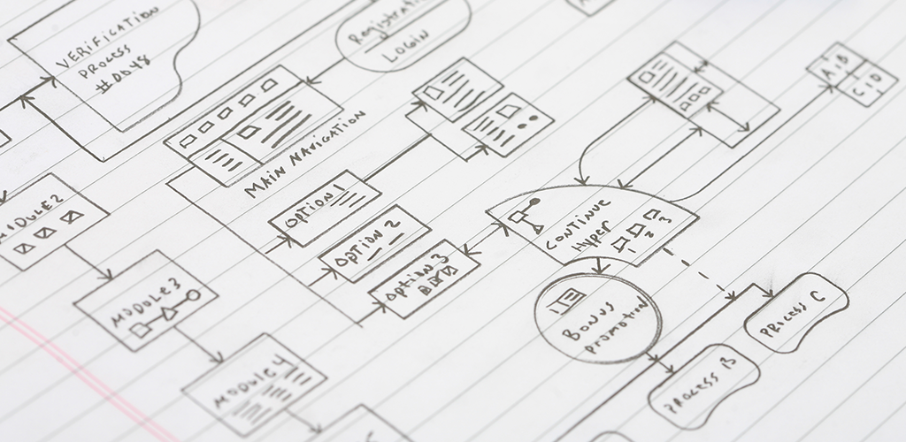
The attention span of a human being is approximately 8 seconds long (which is shorter than that of a goldfish). That means your online store has a very small window of opportunity to grab that attention and keep it. Good design and easy navigation are crucial elements to succeeding in that effort. The design should give your site a beautiful wow factor, while the navigation should offer your customers an intuitive, uber-smooth experience that takes them from browsing to checkout in seconds. When these elements are done well, they improve sales and help you gain a loyal customer base. Whether you’re designing your web store for the first time or planning a site overhaul, here are 7 ways to improve ecommerce site navigation:
- Keep the design uniform
- Use clear labels
- Categorize effectively
- Don’t use hover nav
- Include a search bar
- Don’t break the mold
- Simplify your checkout
- Bonus: review your site data
Keep the Design Uniform
When designing (or redesigning) your online store, start out by planning the big picture of that design. Before you add images or video, before you create detailed product pages, you need to choose a layout. This layout should look good on every single page of your site, because it will be carried out across every page. By keeping a uniform look and feel throughout your online store, your customers will easily get used to your layout and become pros at navigating your store. If you change the design on every page, you’ll create a confusing experience that customers will abandon quickly.
Use Clear Labels as One of the 7 Ways to Improve eCommerce Site Navigation
When a consumer shops with a brick-and-mortar business, they often find signs to help guide them through the store. This prevents them from shopping blindly and just hoping to find the product they’re after. This same principle must be applied to your online store. Every button and product should be clearly labelled so your customers are able to find exactly what they’re looking for. While it might be tempting to jazz up category names to add a fun spark to your site, less is best in this case. If you sell shoes, the button should say “shoes.” The same principle applies to all goods. If your potential customers have to spend time deciphering menus or randomly clicking in the hopes of reaching your product page, chances are you’ve lost a sale.
Categorize Effectivley
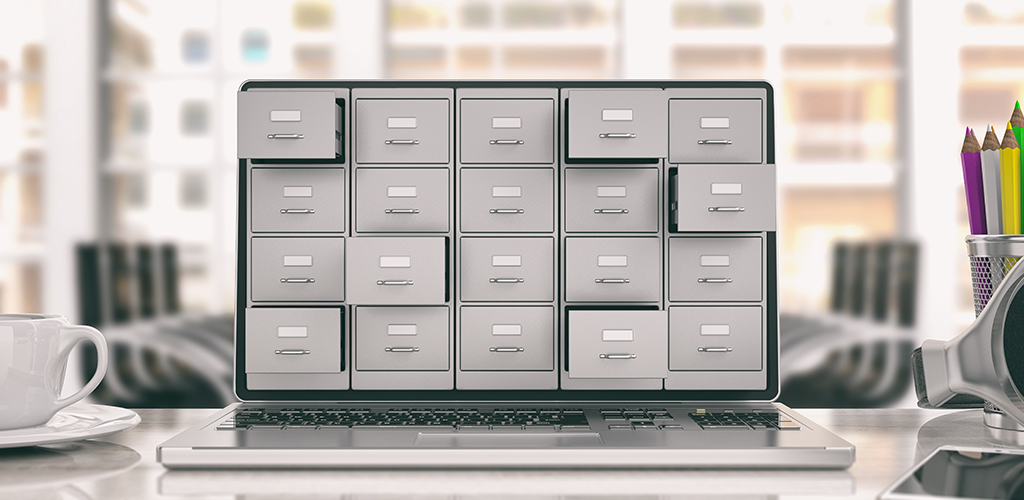
Most ecommerce stores are divided into categories that help customers narrow down their search through your site. For example, a business that sells clothes might first offer users the choice between men’s clothes, or women’s. Those categories are then broken up further, into subcategories like “shirts,” “pants,” “shoes,” “accessories,” “sweaters,” etc. Relevant categories make navigation fast and clear, and improve the experience of your customers. That’s why categorizing effectively is one of the 7 ways to improve ecommerce site navigation. Here are a few tips to optimize your categories:
- Use a Hierarchy: If you sell a wide range of products, you might not be able to fit all of your categories into a single menu on your website. Rather than trying to cram everything in, use a hierarchy. For example, you may run a clothing store that also offers accessories and shoes. Your main categories would be “clothing,” “accessories,” and “shoes.” Within each category, you would then add a further breakdown of subcategories. Under “clothing” you might include things like shirts, pants, dresses, skirts, sweaters, and outerwear. “Accessories” might include belts, purses, and jewelry. And “shoes” could allow customers to browse sandals, boots, flats, and heels. The hierarchy keeps your online store clean yet still easy to navigate between everything you offer.
- Include a New Product and Sale Category: A category for new products helps your customers keep up with new trends in your industry, while a sale category benefits bargain shoppers who want to do business with you but aren’t interested in paying full price on every item.
Don’t Use Hover Nav
One of the 7 ways to improve ecommerce site navigation is to avoid hover nav, which is a form of navigation users can access by hovering their mouse over a menu button. Hover nav is incredibly frustrating because if consumers move their mouse too quickly those menus have a habit of disappearing. They are also not mobile friendly. Instead, use an entirely click-based system of site navigation.
Include a Search Bar
“Window” shopping online is great. By browsing through your products, consumers may find several items they would like to purchase. However, window shopping isn’t for everyone. Customers who visit your website with a specific product in mind don’t want to be forced to scroll through page after page just to buy that one item. By adding a search bar to your online store, you cater both to the window shoppers and the purpose-driven shoppers. Bonus points if your search bar comes with autocomplete, to make the search even easier.
Don’t Break the Mold
You want to show customers your business is unique, but the way to do that is not through your online store navigation. If you break the mold of site design by ignoring established and effective processes, you run the risk of confusing and annoying your customers, who will instead do business with your competitors. The currently established processes work because they have been studied, tested, and are familiar to everyone. Showcase your uniqueness through fun promotions, written content, and multimedia instead.
Simplify Your Checkout
Cart abandonment–which occurs when someone adds an item to their cart but doesn’t complete the purchase–in some industries may be as high as 83%. One of the biggest reasons for this is that the checkout process was too hard to navigate and didn’t flow well. By simplifying your checkout, you increase the odds of turning potential customers into paying ones. Do your best to keep checkout to a single page, add a progress bar, and don’t try to upsell tons of products at this stage.
Bonus: Review Your Site Data
When you actually launch your freshly designed site to the public, don’t just assume your design is perfect no matter how often you tested it. Keep a close eye on your site data for the first few months after launch because this information might alert you to any issues with your store that you were unaware of. For example, do you have a high page abandonment rate on a particular page? If so, take a look at how to improve that page. Is there a category that was once really popular for you but now seems to get no traffic? Perhaps a button is broken or the category has accidentally been buried and is now hard to find. By being proactive with your site data, you can improve your store before small problems build up to be big ones.
Visit Shopivo and stay tuned for exciting news and updates! Sign up for our emails and stay up-to-date on new developments and features.