The Psychology of Color: How to Use Color in Branding Your eCommerce Store

The psychology of color has been studied for centuries. Ancient Egyptians used to connect different colors with varieties of holistic development. Swiss psychiatrist Carl Jung developed theories about how humans experience physical and psychological responses to color. And recently, experiments have been conducted to explore how a brand’s use of color affects customers. Colors elicit emotion, draw attention, and influence decisions. They’re a superhero in the world of marketing. When a business first starts out, they often develop the look and feel of their brand around a common color. That use of color can strongly influence the way a customer thinks about the brand. So how do you know which color to choose? This guide will show you how to use the psychology of color in branding your ecommerce store!
- Red
- Orange
- Yellow
- Green
- Blue
- Purple
- Pink
- Brown
- Black
- White
- Rainbow
Red
Red is a color filled with passion and youthfulness. It’s bold and attention grabbing, but also evokes a sense of warning (there’s a reason stop signs are red). Using red can be extremely effective for exciting your audience but should also be used delicately. The wrong shade of red, or too much of it, can actually frighten customers away, whether they realize it or not. Red is great when used in clearance sales because it actually raises the pulse rate in those who see it, and encourages a quick response.
Brands That Use Red: Coca-Cola, Target, BBC and CNN, Netflix, YouTube
Orange
Orange is especially effective for a brand that caters to a fun, youthful audience; it’s perfect for kids’ brands. It’s an energetic color and can actually increase energy levels in your audience. Orange exudes confidence and friendliness as well, and helps make a brand feel approachable. However, it should generally be avoided for a brand that wants to be considered mature and serious because it evokes the opposite feelings when seen. Orange is a great color to use if you want to attract impulsive shoppers. Like red, it should also be used delicately because too much orange can look garish and turn customers away.
Brands That Use Orange: Tangerine, Fanta, Nickelodeon, Crush, SoundCloud, The Home Depot
Yellow
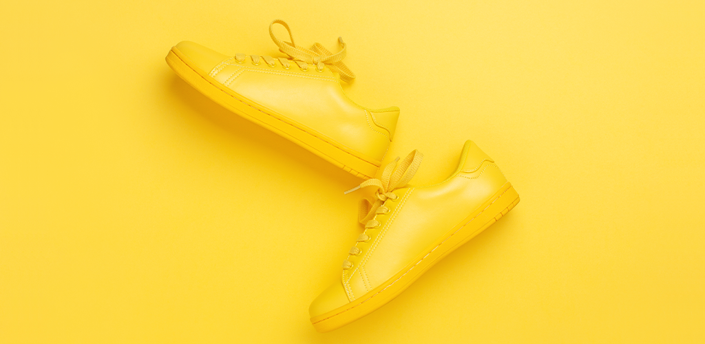
Yellow is the color of sunshine and happiness. It evokes feelings of comfort, optimism and warmth and is great for brands that sell comfort items like warm drinks, cozy furniture, and delicious food. Yellow is also a stimulating color and is excellent at grabbing the attention of window shoppers. It’s one of the least popular colors in branding, however. This may be due to the fact that a study done by Dulux Paints found that yellow is the world’s least favourite color. It’s preferred by only 5% of the population. Yellow is often polarizing, with people either hating or loving it, so it should be used with thoughtfulness and caution.
Brands That Use Yellow: McDonald’s, Best Buy, National Geographic, Ikea, Lipton, Snapchat
The Psychology of Color: Green
Green is a unique color in the world of marketing. It actually has two very distinct meanings depending on which shade you use. Lighter shades of green are fresh and youthful, preferred by many brands who tout themselves as eco-friendly. It’s the color of tranquility and good health, and calms those who see it. Meanwhile, dark green most often represents wealth and money, and works best for more serious brands. It’s great for financial services that help customers make money or save their money. Green is very effective at making customers feel calm and like they can trust the brand.
Brands That Use Green: Starbucks, Toronto Dominion Bank, Spotify, Android, Animal Planet
Blue
More than 40% of men and 30% of women say that blue is their favourite color. That makes it one of the best and most popular colors for branding. Blue signifies strength, trust, communication, and reliability. Like with many of the colors in this guide, the lighter the shade of blue used, the more a brand is associated with being youthful and fun, whereas darker shades create a more serious look and feel. There are two cautions to consider when using blue, however. Be careful not to use a shade that is too dark or includes too much grey because that may trigger associations of depression. Because blue is so calming, it also doesn’t stimulate action from customers and has actually been known to decrease appetite so it shouldn’t be used for a business that sells food.
Brands That Use Blue: Facebook, Twitter, PayPal, Intel, Pepsi, Oreo, AT&T
Purple

Purple is actually a very uncommon color in branding, in part because it’s a darker color that appeals almost exclusively to women. However, the color can be used very effectively, especially for brands that want to be thought of as luxurious, majestic, and feminine.
Brands That Use Purple: Cadbury, Yahoo, Twitch, Crown Royal
Pink
Pink is another color that’s widely considered to be feminine. It’s used almost exclusively with brands that sell mostly to women. In addition to being considered “girly,” the color pink is very effective at creating thoughts of romance, youth, energy, and boldness. Many companies break it out for use in sales around Valentine’s Day. While it’s often used to market towards a gender, pink can be used very well to build a unique brand personality, especially because it’s an uncommon branding color.
Brands That Use Pink: T-Mobile, Baskin Robbins, Hello Kitty, Victoria’s Secret
Brown
The color brown has only been used in marketing in recent years. It’s not a very attractive color to most and is often associated with dirt. However, it has proven effective for use in the recent trend of organic, fair trade, and ethically sourced goods. Brown inspires thoughts of simplicity, honesty, and wholesomeness. It’s also great for a chocolate brand.
Brands That Use Brown: Hershey, Godiva, M&Ms, UPS
Black
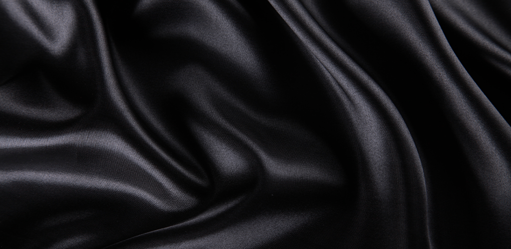
Black is a color known for its simplicity and class. It evokes sensations of luxury and sophistication, sometimes even mystery. It’s excellent to use for high end brands but because it’s so dark, it’s best for serious brands that cater to an older clientele. Because it’s not very vibrant, it also isn’t very good for spurring instant brand recognition. Black can still be used effectively, however, and is especially bold when paired with more vibrant colors. If you choose to use black, play around with different effects including metallic hues, and switching between matte and glossy black to see what really makes your brand pop.
Brands That Use Black: Adidas, Nike, Puma, Chanel, Gucci, Disney, L’Oreal
White
Many people are quick to point out that white isn’t a color so much as it’s a lack of color. Whatever your opinion on the matter, white can be a great tool for use in branding. It’s great for brands who want to be known for their minimalism, simplicity, purity/innocence, and modernity. It is, however, difficult to convey a bold personality with the color white so it shouldn’t be used for a brand that wants to be known for being wild and vibrant.
Brands That Use White: The most well known brand that uses white is Apple
Rainbow
Why choose one color when you can use every color in your branding? Many companies choose to evoke a sense of fun and creativity by using more than one color in their branding. This may also make your brand appear more unique and eye-catching. Consider your budget, however: if your business relies heavily on paper printing, the more colors you use, the more expensive your printing costs will be.
Brands That Use Rainbow: Google, NBC, eBay, Instagram
Before you start creating a visual look for your brand, carefully consider how you want your customers to feel just by seeing your business. Understanding the psychology of color when making your color choice can make or break you.
Visit Shopivo and stay tuned for exciting news and updates! Sign up for our emails to stay up-to-date on new developments and features.