Tips for Designing a Powerful Single Product Website
Some businesses are powerful because they sell hundreds, if not thousands of products to their customers. Companies like Amazon and Wal-Mart have built massively successful, far-reaching empires based on this model. Meanwhile, other brands sell a single, well-designed product and enjoy just as much success as their competitors. Notable names that started out with this model (some of whom still operate under it) include Crocs, Spanx, Michelin, and Casper. In the case of each of these businesses, their founders knew that if they could make one, specific item really well, they could take the world by storm and launch a wildly successful company. For other entrepreneurs who either want to emulate that success or simply want to launch a small business based around a proprietary item, here’s why you should design a single product website, and how to do it well:
- Pros and cons
- Pick the right layout
- Plan your page content
- Make use of dynamic images
- Balance information and design
- Develop consistency guidelines
Pros and Cons

When most people imagine creating their own ecommerce business, their minds create the image of an online store that sells a wide-range of products. However, a company that focuses on doing one product really well can enjoy just as much success, frequently with a greater level of ease. Here are some of the pros and cons of launching a single product website:
- Pro: Because the focus of a single product site is on one item only, it helps customers focus on that one product without getting distracted by others. This can help lead to better conversions versus a multi-product site.
- Pro: By only have a single item to build your marketing efforts on, you can increase the effectiveness of your campaigns.
- Pro: Only selling a single item allows you to focus all your attention on it. You’ll have a clear idea of what tweaks and adjustments need to be made in order to make your product the best it can possibly be.
- Con: If the product you sell doesn’t need to be replaced often (for example, Casper’s mattresses), running a single product website/business reduces the likelihood of building a repeat customer audience.
- Con: If your industry is a competitive one, sticking to selling one item only may dull your competitive advantage if competitors begin introducing complimentary products to their lineup.
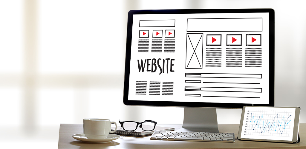
Pick the Right Layout

Whether you’re using an ecommerce platform that offers templates, or you’re building your store from scratch, choosing or designing the right layout for your single product website is absolutely crucial. In addition to highlighting your product, the site should also utilize an eye-catching design, be versatile enough to share every important detail about your “catalogue” and brand, and flow naturally to a checkout page in order to increase conversions. There are a few tactics that are especially effective for web stores that only sell one item:
- Hero Images: A hero image is a visual of your product, normally presented as a large, front-and-centre banner on your ecommerce store. This image typically fills the screen and highlights the item being sold by your company so that customers see it brought to life before their eyes. With a hero image, there is usually no question about exactly what you sell.
- Minimal Pages: When you sell only one item, you want the focus of your web store to be on that item. Don’t allow customers to get away from that focus by packing your website full of pages and articles that take them further and further away from your product page. Instead of creating a dozen unique pages, consider putting it all on the home page, in the form of scrollable content. Allow customers to navigate to certain sections with buttons that auto-scroll for them.
Plan Your Page Content
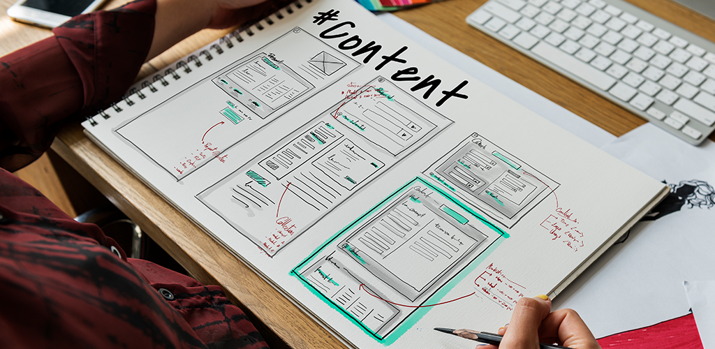
As mentioned above, you should consider designing your website with as few pages as possible. But, if you use the scrolling home page, it can get lengthy with all the content that good store design requires. In general, most businesses can get away with adding an About section, FAQ page, testimonials, and a contact form to the home page content. Secondary pages (that navigate away from the home page) usually include policies (privacy and return policies, etc.), a blog, a product page with more in-depth information about the item you sell, and the checkout page. Plan each section carefully to ensure it harnesses SEO power, doesn’t overwhelm the reader, and is easily digestible on all devices.
Make Use of Dynamic Images

A study conducted by Forbes discovered that 95 percent of viewers were more likely to retain information that is conveyed through a video, compared to just 10 percent of viewers who saw that information displayed as a static image. Another claim by the executive creative director at G&G Digital states that 64 percent of consumers were more likely to make a purchase after seeing a product video. With numbers like that, it’s hard to argue against the effectiveness of videos and similar content (like GIFs). So, it’s prudent for your business, and any business, to produce professional video content to help highlight your product even more effectively.
Balance Information and Design

Before a person makes a purchase, they want to know something about the product they are buying. This is even more important for ecommerce stores, which don’t have the advantage of allowing customers the chance to see products in person before they buy them. However, many business owners are tempted to cram as much information as they can into a single page, which results in the sacrifice of good design. Rather than accepting one or the other, critically consider how to balance both elements. Some ways of doing this include using bullet points instead of paragraphs, creating a product diagram with pop-up feature text, and using collapsing columns to hide groups of text until a customer opens them up.
Develop Consistency Guidelines for Your Single Product Website
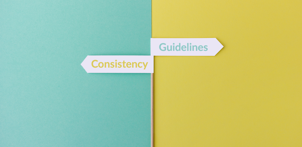
Whether your website has one page or ten, each of those pages must work together to create a cohesive, consistently branded experience for shoppers. That’s where consistency guidelines come in. These rules for your business-specific design will help you carry that design throughout your entire web store even if you create them independently, so all pages create a common look and feel. A few things to establish in your guidelines include:
- Colour Scheme: If the dominant colour on your home page is sky blue, but the dominant colour on your checkout page is neon pink, you will create a jarring experience for customers. In some cases, this design faux pas reduces the overall authority and professionalism of your web store and may cause customers to rethink their purchase.
- Fonts: In general, a website should choose one or two fonts to use throughout the entire site. This helps to create a cohesive experience that looks professional. Font guidelines should also establish what sizes should be used where, and when a header is required over normal text.
- Logo Use: Your logo is the image that symbolizes your whole brand. It needs to be displayed prominently on your website in a place that is easily seen and consistent across pages (usually in a header).
Visit Shopivo and stay tuned for exciting news and updates! Sign up for our emails and stay up-to-date on new developments and features.