Wow Your Audience With These Social Media Graphic Design Tips
Entrepreneurs must be jacks of all trades. We’re the idea-generators, manufacturers, customer service representatives, accountants, and graphic designers of our businesses, in addition to even more roles. However, not all of these skills come naturally. They must, instead, be learned. Being able to design your own graphics is one such ability that many people must be taught in order to be good at. While there’s an enormous range of graphics that a person might want to make, from posters and flyers to brochures and pamphlets, we’ve decided to focus specifically on social media graphic design (although many tips can be transferred between mediums). Take a look:
- Get the size right
- Draw mock ups
- Create a consistent look and feel
- Decide on your images
- Plan your text
- Choose the right font
- Add your logo
- Review before publishing
- Other tips
Get the Size Right
There are dozens of different social media platforms that businesses can use to advertise their brand. Each one of them recommends a different optimal size for the images displayed on those platforms. This size recommendation helps guide designers to ensure that the graphics they make look good on both desktop and mobile devices. These are the currently recommended social media graphic sizes for the most popular platforms:
- Facebook Profile/Business Page Picture: 180 x 180 pixels
- Facebook Cover Photo: 820 x 312 pixels
- Facebook Shared Image: 1200 x 630 pixels
- Facebook Event Image: 1920 x 1080 pixels
- Twitter Profile Photo: 400 x 400 pixels
- Twitter Header Photo: 1500 x 500 pixels
- Twitter Shared Image: 440 x 220 pixels (minimum – use a 2:1 ratio)
- Instagram Profile Picture: 110 x 110 pixels
- Instagram Photo Size: 1080 x 1080 pixels (1:1 ratio)
- Instagram Stories: 1080 x 1920 pixels
Draw Mock Ups
Before sitting down in front of your computer to actually design your first social media graphic, you need to start old school. Grab a pencil and piece of paper and sketch out a few different design ideas. There’s absolutely no need to be a good artist to do this so don’t be afraid to embrace stick figures and chicken scratch. The mock ups that you draw are meant to provide a quick guideline of how to layout your graphics when you actually get to the computer so you can create your digital design faster.
Create a Consistent Look and Feel with Every Social Media Graphic
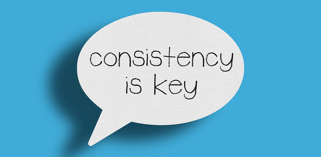
When you first launch a social media platform for your business, you’ll have to take a little bit of time to experiment with the look and feel of the graphics you come up with. Different styles will better suit different brand personalities. However, once you settle on a particular style or theme, the majority of your graphics should follow similar patterns in order to build a cohesive brand image for your audience to interact with. Consistency can be achieved through the use of colour, layout, tone, and more.
Decide on Your Images
Once you have a mock-up image consistent with your brand’s style, it’s finally time to fire up your design program of choice. You’ll start out with a blank canvas with which to work. As you wade deeper into the design process, you’ll start layering different elements onto the canvas to create stunning, professional graphics. The layer most designers choose to start with is the base image. This image could be a photograph that illustrates the information you wish to convey. It could also be an illustration or a simple, plain background to give your design a pop. Your image will give you a solid base upon which you can build the rest of your social media graphic. In this step, you can also prepare any other images you’re going to add to the graphic later on, so they’re all ready at your fingertips.
Plan Your Text
In some cases, a basic image might be all that’s required to convey your message. However, more likely than not, you’ll also need to add some text to your design in order to make it clear. Are you hosting an event? Running a sale? Launching a new product? Explain it with text! Unfortunately, the tendency of new graphic designers is to cram their canvas absolutely full of text, to explain any and every detail of their business and design to the intended audience. This tactic clutters images and ensures that people just keep scrolling if they come across such an image. Instead of adding in every word you can think of, plan your text carefully. Write a few different versions of it in order to come up with the option that conveys all the required information but with the smallest amount of words possible.
Choose the Right Font
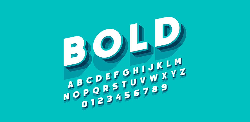
The next step in designing an effective social media graphic is to choose the right font to accompany the text information. That’s right, we said “font,” singular. Just as many first-time graphic designers try to shove as much text into their design as possible, they also often try to use three, four or even more different fonts all in the same post. This is another tactic that clutters a graphic and ensures that an audience skips right over it. Instead, choose just one font (two at most) and stick with it for the majority of your content. The best fonts for social media tend to come from the Sans Serif family.
Add Your Logo
When you publish a graphic online, it has the potential to be shared by dozens, if not hundreds, of strangers. This is great for your business. Unless, of course, no one knows you made the graphic. Such is a common problem for social media sharing because content can be reposted without crediting its source, meaning your brand could get lost in the shuffle. Rather than allowing that to happen, always add your logo to your design work so that every viewer knows it belongs to you.
Review Before Publishing
When you’re finished designing your graphic, don’t immediately publish it to your social media accounts. Instead, get a fresh set of eyes to look at it and offer feedback on how to make it better. In most cases, the eyes of the designer are biased to like the graphic and are likely to miss flaws, such as poor legibility, that a stranger would notice.
Other Tips
There are hundreds of other tips and “rules” that graphic designers around the world could tell you. While some are entirely preference-based others, such as these, are standards that every designer should know:
- Follow a Hierarchy: In western culture, reading is done from left to right. We absorb digital media, such as graphic design, in this fashion as well. Our eyes are also automatically drawn to the biggest and brightest elements of an image. Keep this in mind while designing. Make sure the most important elements of your graphic come first so that they aren’t missed by your audience later.
- Use Colour: Colours are used to convey emotions and feelings. You should use them to evoke a response in your audience. Different colours represent different things so do some research prior to starting your design in order to make the most effective use of colours (including black and white). Take a look at this article here to get a good idea of how colours are perceived.
- Incorporate Lines: Something as simple as a straight line can bring an element of cohesion and clarity to a graphic. Lines help guide the eye to important aspects of an image and can also bring a bit of movement to an otherwise flat picture.
- Master Scale and Proximity: If the proportions used in an image are wrong, the whole feel of the design can throw off audiences. That’s why mastering scale (the size of different elements) and proximity (how close elements are to one another) is so important.
- Try Movement: Thanks to modern technology, designers now have the option to create moving graphics (such as GIFs). Because movement naturally attracts the human eye, a dynamic design is likely to get you more attention than a static one.
- Don’t Be Afraid to Try New Things: The graphic design industry moves quickly and changes constantly. Don’t let fear of the new and unknown hold you back in a rut. Embrace changes that will propel your business higher than ever.
- Use Templates: Whether you just aren’t any good at graphic design, or you want a faster way to create professional looking graphics, templates could be a solution. There are many platforms available, such as Canva, that pre-make designs. All a user has to do is personalize it for their own brand and bam, you have professional graphics in minutes.
Good social media graphic design is a crucial element that brings a level of professionalism and personality to any brand. These tips can help anyone polish their design skills to a bright shine.
Visit Shopivo and stay tuned for exciting news and updates! Sign up for our emails and stay up-to-date on new developments and features.